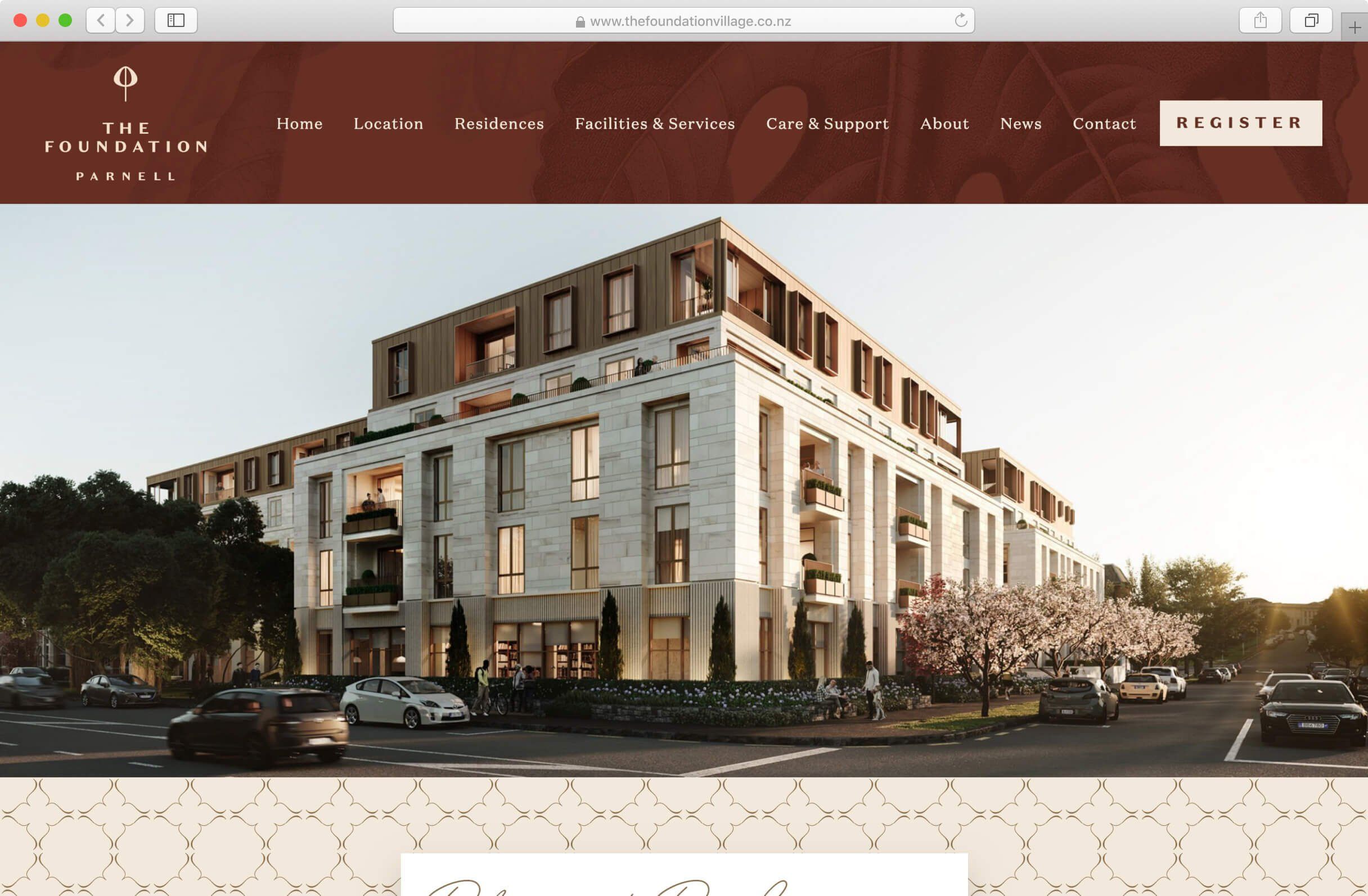
The Foundation
The Foundation is one of several retirement villages run by Generus Living Group, a privately owned New Zealand Company. The Foundation site advertises the latest addition to Generus’s portfolio and is set to be the most luxurious of their Retirement Villages to date.
The Mission
The client had worked with a brand agency to establish the look they wanted; this included logos, colour palettes and type choices as well as a library of patterns and graphic assets.
Our job was to take the new brand guidelines and interpret how this would translate digitally across different devices.
The Foundation is yet to be built so we had to really sell the concept with limited resources and turn around the design and development of the site in a relatively short time.
The Outcome
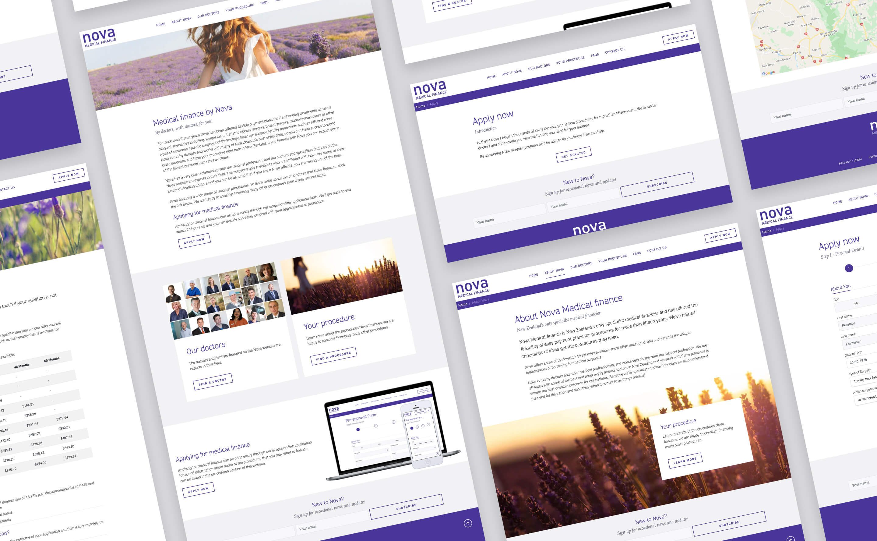
We approached this project on 2 fronts; the styling and layout of the site itself and the form design.
Our approach to the overall aesthetic was a softer, more femine look. The client had highlighted women in their 30-40s as a key demographic, especially women who had gone through one or more childbirths and were not happy with how their bodies had changed. Art Direction was important here as we wanted to communicate a calming, emotive quality to the layouts through the Stock photography and colour palette. The brand purple was quite saturated so we balanced this with neutral colours and photos that had a softer feel.
We addressed a number of issues with the Application process which had been highlighted in the initial scoping phase of the project. First we made the application process personal by crafting copy that spoke to the applicant and led them through the steps. We kept the four steps of applying but made this clearer in the UI so that applicants knew exactly how far into the process they were. We made lots of improvements to the form structure and UI such as repositioning the form labels above the fields so these were easier to read. We used more appropriate fields and elements such as toggle buttons to reduce the number of clicks required to make selections. Lots of little improvements like this made a big difference.
Our team also addressed some of the clunky form logic and bad UX by prototyping and testing out different strategies to see what might work better. We have a lot of experience in this type of work and we threw all of our knowledge into this form to deliver something that looked good but was great to use.
The Impact
It’s great to have a website that looks good but if your business relies on sign-ups or form submissions you need to have a carefully planned and well executed form. That only comes with experience, attention to detail and an understanding of user needs.
We listened carefully to the client and were able to expand on the information captured by the form without complicating the process. The form redesign alone has greatly improved their business. We addressed a number of pain points for the client with the new form, with the CMS handling the submissions and sending out automatic responses and updates freeing up time for the Nova team.
The fresh new look has been well received and has instilled confidence in the brand in their target audience which is important when customers are going to be applying for large sums of money.
We will continue to work alongside Nova Medical, monitoring the data we receive via the CMS and Analytics to look for ways we can further improve the Application.
Services
- Project Planning & Management
- Content Strategy
- Wireframing
- Prototyping
- User Experience Design (UX)
- User Interface Design (UI)
- Front-end Development
- Ongoing CMS customisation & support
We have been working with Hayden and his team at 72dpi for well over 10 years. They design, develop and maintain multiple websites on our behalf, as well as create complex bespoke online systems for a variety of purposes. The service we receive and the end-product is always top class.